FaceBook: Project Size Score vs. Trend Score
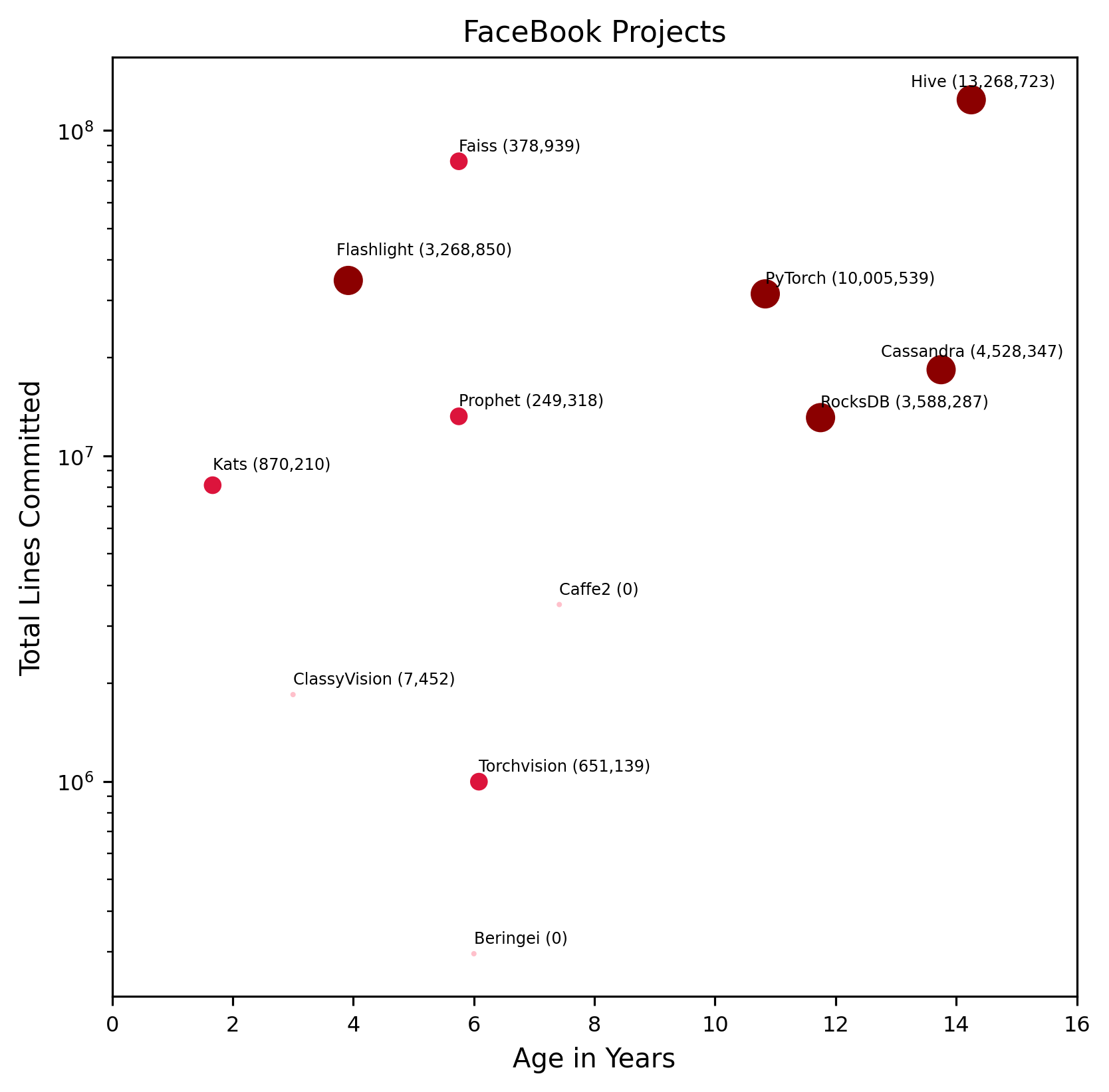
X Axis: binned average of several absolute metrics (e.g. total commits)
Y Axis: binned average of several relative trend metrics (e.g. year-over-year cocmmits)
Red line: linear fit of the data. Projects above the red line are growing fast for their size. Projects below the red line have slower growth.
Markers: orange markers correspond to labeled projects, blue to unlabeled
(see subcategory charts for more detail)